Brand Guideline
Catalogue & Brochures
Promotional Items
Image Library
Videos

Tomoil logo

The shield logo is the most recognizable element of the Tomoil corporate identity. This logo takes priority, and in case of doubt about logo usage, we recommend using this variant. The logo with the tagline 'Powering Performance' is used as a closing element when there is sufficient space, such as on the back of a brochure, business card, or trailer. The landscape logo should only be used in exceptional cases, as a secondary option to the shield logo when limited space compromises readability and visibility. It is suitable for wide applications.

Tomoil Logo Navy

logo_description_1

Tomoil Logo White

logo_description_2

Tomoil Logo Red

logo_description_3

logo_description_4

Color Palette

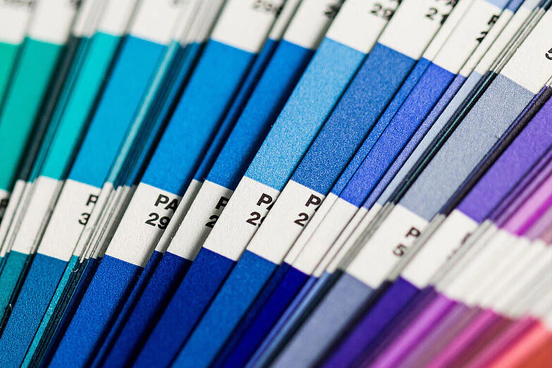
Color

A strong brand has a recognizable and consistent brand identity. This brand identity manual provides guidelines for the correct usage of various brand identity elements, such as the logo, colors, fonts, and photography. You will also find examples here for the proper application of the brand identity across different design materials, including advertisements, brochures, banners, and flyers.

Typography

Typography

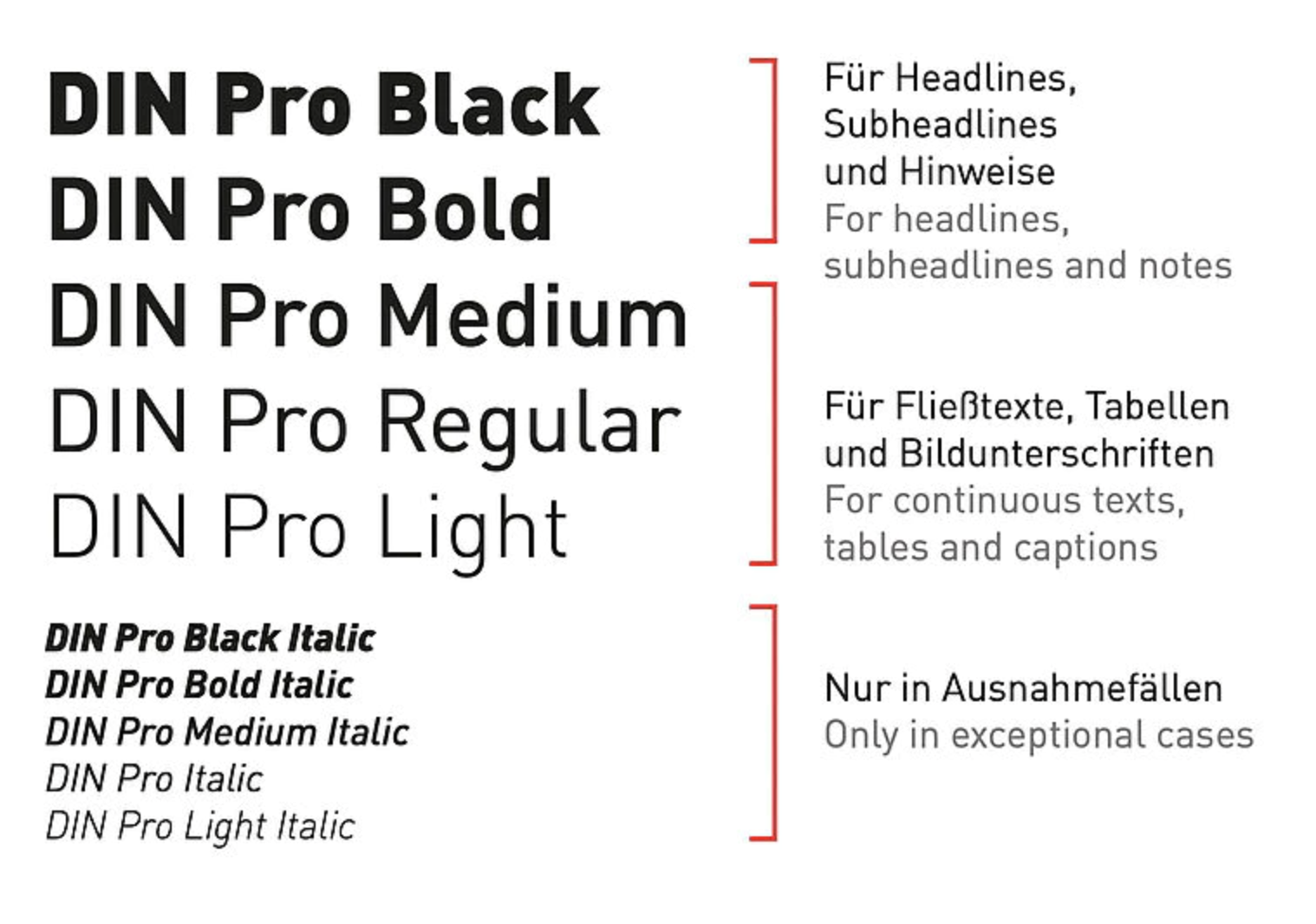
A strong brand has a recognizable and consistent brand identity. This brand identity manual provides guidelines for the correct usage of various brand identity elements, such as the logo, colors, fonts, and photography.

Our Logo

The TOMOIL logo embodies our visual identity and should be used clearly and consistently across all media and formats.

Our Logo

TOMOIL Logo

Official TOMOIL logo in brand colors on a white background. Maintain original proportions and colors. Do not alter or add effects.

Racing Car

Our imagery

A strong brand has a recognizable and consistent brand identity. This brand identity manual provides guidelines for the correct usage of various brand identity elements, such as the logo, colors, fonts, and photography. You will also find examples here for the proper application of the brand identity across different design materials, including advertisements, brochures, banners, and flyers. The blue, red and white logo is LIQUI MOLY's trademark and has a high recognition value. The main colors have been defined for all print and web applications. There are separate color schemes for special product areas, which are explained on the following pages.

Corporate
Dealership and formulas
Sponsorship

Videos

We have everything in place to promote our products. Here you will find marketing materials including videos that can be used for social media, websites, presentations, and more.